Facebook Ads Automation Tools That Make Campaigns Easier to Run
Top Facebook ads automation tools to manage campaigns, test creatives, optimize budgets, and reduce manual work without losing control.
Jan 26, 2026


A Shopify sales funnel is often presented as a clean sequence of steps. Awareness, interest, purchase, repeat. In real life, it rarely looks that tidy. People jump between tabs, hesitate, leave without warning, and come back when it suits them.
That’s exactly why an effective funnel matters.
A good Shopify sales funnel doesn’t try to control behavior. It adapts to it. It gives visitors enough clarity to keep moving, enough trust to feel comfortable, and enough momentum to finish what they started.
This article focuses on how to build a Shopify sales funnel that works in practice. Not a perfect diagram, but a structure that supports real decisions, reduces friction, and makes buying feel easier instead of rushed.
A Shopify sales funnel is not a single page or app. It is the full experience someone has from the moment they first encounter your store to the moment they decide to buy, and whether they come back after that.
That experience stretches across ads, search results, landing pages, product pages, emails, checkout, and post-purchase communication. If those pieces do not align, the funnel leaks.
The goal is not to guide people perfectly. It is to make each step feel logical and low-effort.
Before optimizing anything, it helps to understand why someone arrives at your store in the first place.
A visitor coming from a Google search usually wants reassurance and detail. A visitor coming from a social ad wants relevance and clarity. A returning visitor wants confirmation that now is the right time to buy.
Treating all traffic the same flattens intent and weakens the funnel. Effective funnels acknowledge where people are mentally, not just where they are technically.

At Extuitive, we focus on the point in the Shopify sales funnel where most brands lose momentum early. The moment between first exposure and real interest. This is where assumptions often replace evidence, and creative decisions are made without proper validation.
Our platform is designed to remove that guesswork.
We use a proprietary ecosystem of more than 150,000 AI consumer agents modeled after real behavioral data. These agents act as an always-on focus group, testing ad creatives, copy, visuals, and pricing before anything goes live. Only ideas that show real resonance move forward.
For Shopify brands, this means stronger performance at the awareness and consideration stages. When ads and landing pages are validated in advance, traffic arrives with clearer intent. Visitors recognize the message faster, engage longer, and reach product pages with fewer doubts.
Creation on Extuitive is not linear. Our AI agents generate multiple variants, apply selective pressure, and surface the highest-performing options based on current market conditions. What teams launch is not a guess. It is the result of testing what works.
When the top of the funnel is built on evidence rather than intuition, the rest of the funnel becomes easier to optimize and more reliable to scale.
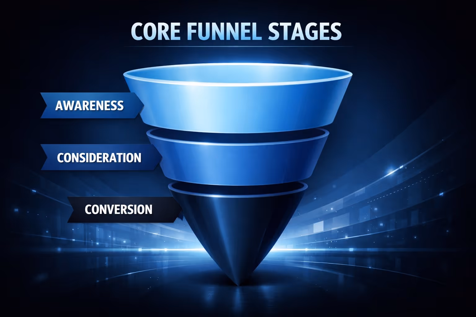
Most Shopify funnels work better when you stop thinking in dozens of micro-steps and focus on a few meaningful stages. These stages are not rigid rules. They are reference points that help structure decisions and identify where things usually break.
At this stage, the goal is not to sell. It is to establish recognition and relevance as quickly as possible. Visitors need to feel that what they just clicked aligns with what they expected to see.
Messaging should closely match the traffic source. Someone arriving from a search result expects clarity and answers. Someone clicking an ad expects relevance and focus. Sending both to a generic homepage often weakens that first impression. In many cases, a simple, targeted landing page performs better because it removes unnecessary choices and keeps attention centered.
This is the stage where product pages do most of the heavy lifting. Visitors are no longer just curious. They are comparing options, weighing trade-offs, and looking for reasons to trust the offer.
Hesitation is normal here. Clear benefits, honest descriptions, and visible trust signals matter far more than visual effects or clever layouts. Reviews, shipping clarity, and realistic product imagery often influence decisions more than design details that look impressive but add little substance.
By the time someone reaches checkout, the decision is usually half-made. The job of this stage is not persuasion, but reassurance.
Checkout should feel familiar and predictable. Unexpected costs, forced account creation, or unclear next steps increase abandonment quickly. After purchase, clear confirmation and post-purchase communication help reduce buyer anxiety and set the tone for repeat business. When this stage feels calm and straightforward, the funnel closes naturally.
The first page someone lands on should not try to introduce your entire brand, explain every product, or tell a long story. Its role is much simpler than that. It needs to confirm that the click they just made was the right one.
That confirmation usually happens fast. Often before someone scrolls.
It comes down to a few core elements working together. A clear headline should reflect the promise or question that brought the visitor there in the first place. Visuals should provide context and help people imagine the product in use, rather than acting as decoration. And there should be a single, obvious next step that does not require thinking or interpretation.
When this page does its job well, visitors naturally continue exploring. When it does not, even interested shoppers hesitate. If people have to pause to figure out where they are or what to do next, the funnel has already lost momentum.
On Shopify, product pages often determine whether the funnel keeps moving or quietly stalls. By the time someone reaches this page, interest already exists. What they need now is clarity, not persuasion.
People rarely read product pages from top to bottom. They scan, jump between sections, scroll back up, and look for specific answers that help them decide. Effective product pages are structured around that behavior instead of fighting it.
What usually helps at this stage:
Long descriptions are not the problem. Confusing ones are. When information is organized and easy to navigate, shoppers feel more confident and move forward without needing extra nudges.
Effective product pages tend to share the same underlying structure, even when they look different on the surface. The common thread is not design style, but how clearly they help visitors reach a decision.
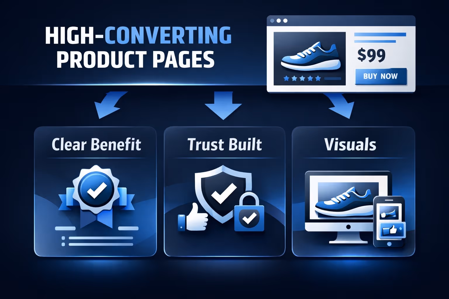
Strong product pages lead with the outcome, not the feature list. Visitors should understand the value of the product within seconds, without having to interpret technical details or compare multiple claims. One clear idea almost always performs better than several competing messages fighting for attention.
When the main benefit is obvious, everything else on the page feels easier to process.
Trust grows faster when details feel concrete and real. Reviews that mention actual situations or use cases tend to be more convincing than generic praise. Shipping information, return policies, and guarantees should be visible early so shoppers do not have to search for reassurance.
Familiar payment options also play a quiet but important role. When the checkout experience feels recognizable, hesitation drops naturally.
Images are not just there to make the page look good. They help visitors understand how the product fits into their life. Contextual visuals often outperform studio shots because they answer unspoken questions about scale, use, or results.
A simple example of what usually works well:
Overloading galleries with repetitive or decorative images often backfires. When visuals support understanding instead of distraction, confidence builds more quickly.
When product pages answer questions before they are asked, visitors stay longer and move forward with less friction.
Email and SMS sign-ups can support a sales funnel, but only when they appear at the right moment. When capture attempts interrupt someone who is already close to buying, they often create friction instead of value.
Lead capture works better when it feels like help rather than a demand. Exit intent, return visits, or moments of hesitation in the cart tend to be more effective opportunities than immediate popups. When the timing makes sense, people are far more willing to engage.
Checkout problems rarely announce themselves clearly. Instead of obvious errors, they show up as silent exits that are easy to miss if you are only watching final sales numbers.
People abandon carts for simple reasons like friction, surprise, or doubt. Even small inconveniences feel amplified at this stage. A smooth checkout is not meant to stand out or impress. It is meant to disappear, letting the purchase feel easy and natural.
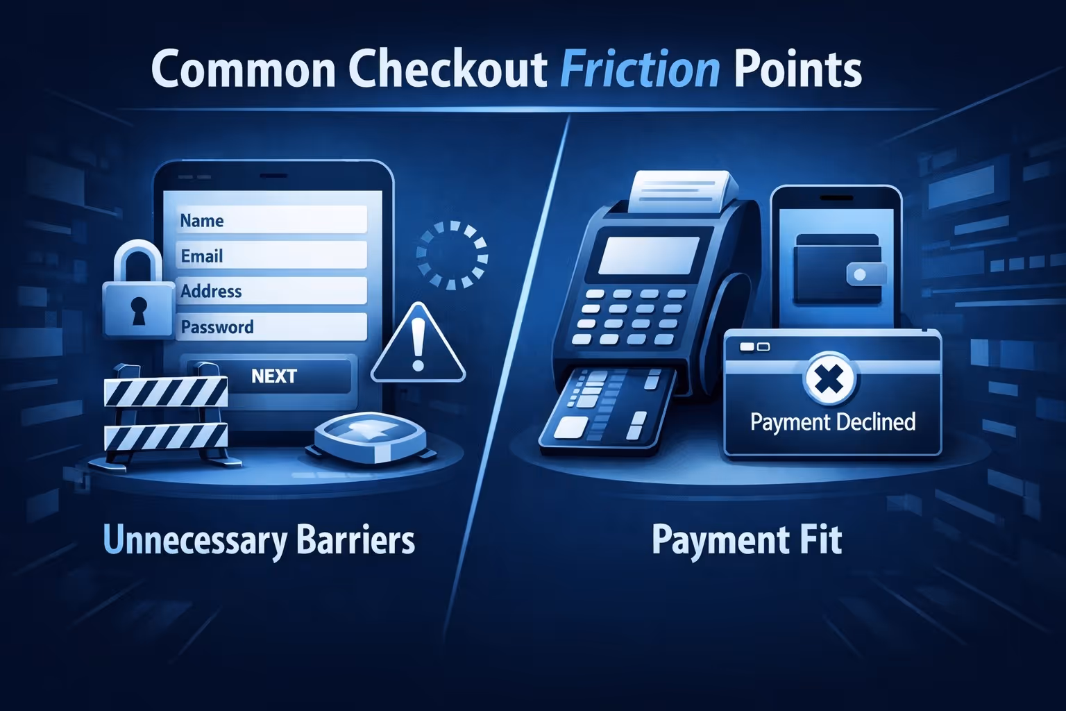
Instead of redesigning everything at once, it is usually more effective to focus on the issues that most often interrupt conversion. Small points of friction at checkout tend to have an outsized impact, especially when buyers are already close to making a decision.
Forced account creation is one of the fastest ways to increase abandonment. When shoppers are required to register before paying, hesitation rises and momentum drops. The same happens when checkout forms ask for information that does not clearly serve the purchase. Simpler flows help people finish without second-guessing their decision.
Cost surprises create a similar reaction. Late shipping fees or taxes that only appear at the final step can break trust instantly. Clear totals, visible early in the process, matter far more than clever pricing tactics. When people feel informed rather than tricked, they are more likely to complete the purchase.
Checkout performance matters most on mobile, where patience is thinner and small obstacles feel bigger. Buttons need to be easy to tap, text needs to be readable, and pages need to load quickly. Even minor delays at this stage can push people to abandon and move on.
Payment options should also match mobile habits. If shoppers do not see a familiar or preferred method, doubt creeps in. Making payment feel natural and expected helps remove the final layer of hesitation.
Fixing these basics often improves conversion more than adding new tools or features ever will.
Not every abandoned cart represents a lost sale. In many cases, it reflects hesitation, timing, or the need for more reassurance rather than a hard no. People often step away to think, compare options, or simply get distracted.
Follow-up emails work best when they sound human and genuinely useful. Simple reminders, clear answers, or reassurance about shipping and returns often outperform urgency-driven messages or automatic discounts. When abandonment rates are high, it usually signals that a key question was left unanswered earlier in the funnel.
What happens after payment plays a major role in whether someone comes back. Clear order confirmation, realistic delivery expectations, and thoughtful follow-up reduce buyer regret and reinforce trust in the brand.
That trust carries forward into retention, referrals, and long-term value. Funnels that stop at the thank-you page miss an opportunity to strengthen the relationship at a moment when the customer is most attentive and receptive.
Sending more messages does not automatically build loyalty. In many cases, it does the opposite. When communication becomes frequent but unfocused, people stop paying attention. Retention improves when messages feel timely, helpful, and connected to what the customer actually cares about.
Segmenting customers by behavior helps keep communication useful. A first-time buyer needs reassurance and guidance, while a repeat customer may respond better to thoughtful recommendations or early access. High-value customers often expect a different level of treatment altogether. When messaging reflects these differences, funnels continue working long after the first sale instead of fading out.
Funnels improve faster when the metrics you track actually match the intent of each stage. Looking at the wrong numbers often leads to the wrong conclusions, even when traffic and sales appear healthy on the surface.
Each part of the funnel tells a different story:
Focusing only on revenue can hide early friction points. A drop in engagement or add-to-cart rate often signals a problem long before conversion numbers fall.
Data is most useful when it supports clear thinking rather than replacing it. Metrics help highlight patterns and weak spots, but judgment is still required to decide what to change and what to leave alone.
An effective Shopify sales funnel does not feel engineered. It feels considerate.
It respects attention, answers questions, removes friction, and lets people decide at their own pace. When the experience makes sense, conversion becomes a natural outcome rather than a forced one.
Build for clarity first. Optimize second. The results usually follow.


