When Does Shopify Payout? Understanding the Timing
Wondering when Shopify pays out your earnings? Here's how the Shopify payout schedule works and what can delay your money.
Mar 25, 2026


Picking a Shopify theme isn’t just about how pretty your store looks - it’s about speed, usability, and whether it actually helps you sell. With hundreds of options out there, it can feel like scrolling through an endless maze of demos, sliders, and fonts. But don’t worry - we’ve done the digging for you. In this guide, you’ll find themes that are sleek, practical, and surprisingly easy to tweak, whether you’re a one-person shop or scaling fast. Let’s get into the ones that actually make a difference.

Our platform Extuitive helps Shopify store owners simplify the way they create and test ads. By connecting your store, our platform makes setting up campaigns straightforward and reduces the usual back-and-forth. Once connected, the platform generates ad variations and validates them using AI simulations of consumer behavior, providing insights into potential performance before any budget is spent. This helps merchants focus on the ideas most likely to succeed without committing unnecessary resources.
The interface emphasizes clarity and practicality, guiding users through each step efficiently. From generating creative options to tracking performance metrics, Extuitive keeps everything in one place, saving time and reducing guesswork. By combining automated analysis with actionable insights, our platform allows Shopify stores to refine campaigns quickly and confidently.
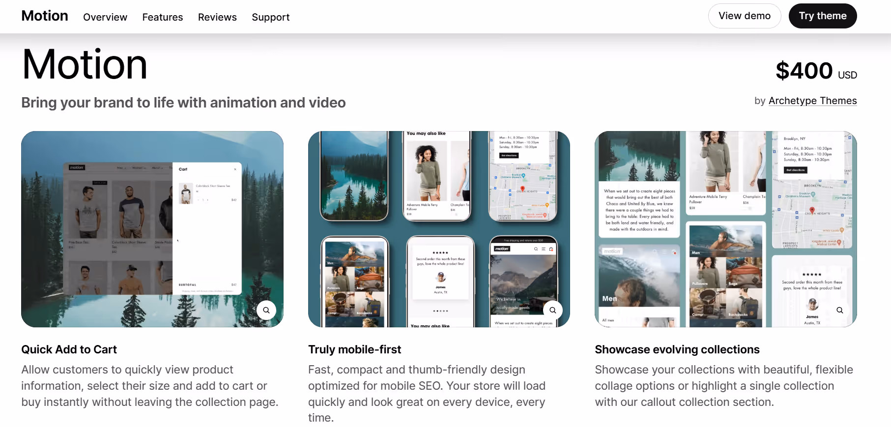
Motion is designed to create a dynamic and interactive shopping experience on Shopify stores. It focuses on smooth animations and transitions that help guide visitors through products and pages without being overwhelming. The theme provides flexible layout options for homepages, product pages, and collection pages, making it easier to highlight key products and promotions. Users can adjust sections and content blocks without touching code, allowing for experimentation with different layouts and visual storytelling approaches.
Motion also includes features aimed at improving visual engagement and usability. Animated elements, hover effects, and transition options provide a way to make pages feel more responsive and modern. While the theme emphasizes motion and interactivity, it also ensures that stores remain readable and fast-loading across devices. Integration with Shopify’s built-in tools and app ecosystem allows for added functionality without complicating the setup or workflow.
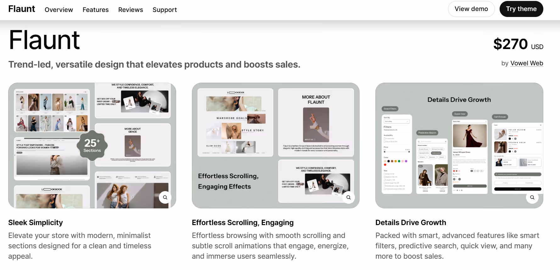
Flaunt is designed to give stores a modern, editorial-style layout that emphasizes imagery and clean design. The theme provides flexible sections for homepages, product pages, and collections, allowing stores to create a visually consistent look without relying on code. Users can adjust image sizes, grids, and text placement to balance visuals with product information, making it easier for visitors to navigate and explore the store.
Flaunt also includes tools to support content organization and engagement. Features like featured collections, promotional banners, and customizable sections help stores highlight products or campaigns effectively. The theme is built to perform well on different devices and screen sizes, maintaining readability and smooth navigation across desktop and mobile. Integration with Shopify’s ecosystem allows users to extend functionality if needed without adding complexity.
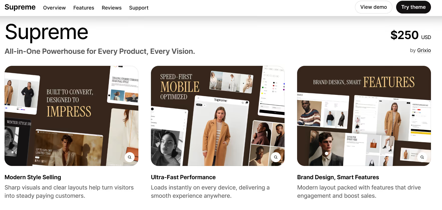
Supreme is designed to provide a straightforward and versatile layout for Shopify stores that want a balanced mix of visuals and product information. The theme offers customizable sections for homepages, product pages, and collections, making it possible to arrange products and content in a way that suits different store styles. Users can adjust grids, text placement, and banners to create a clean and consistent browsing experience for visitors.
Supreme also emphasizes clarity and usability across devices. It includes tools for organizing featured products, promotions, and collections without adding complexity. The theme works well on desktop and mobile, keeping navigation smooth and maintaining readability even with multiple products or large images. Integration with Shopify’s built-in features allows stores to extend functionality when needed while keeping the setup simple.
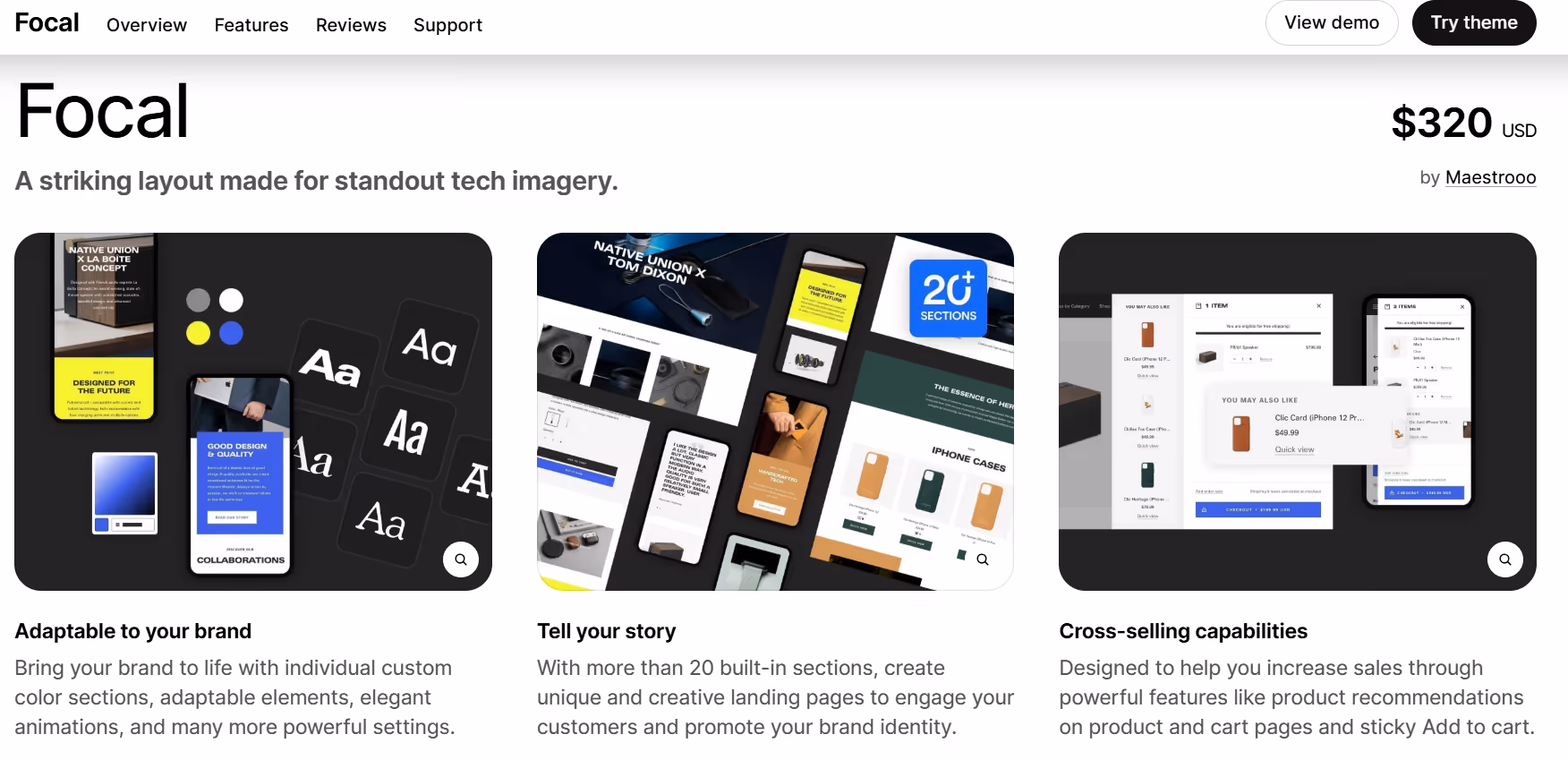
Focal provides a layout that emphasizes simplicity and product presentation, allowing stores to showcase items clearly without distractions. The theme offers adjustable sections for homepages, collections, and product pages, giving users control over how images, text, and featured products are displayed. The focus on clarity makes it easier for visitors to browse, compare, and explore products, while maintaining a balanced and organized visual structure.
Focal also supports tools for organizing content and guiding shoppers through the store. Features like featured collections, banners, and flexible content blocks help manage information effectively across different pages. The theme is built to perform well on both desktop and mobile, keeping the user experience consistent and smooth. It integrates with Shopify’s native features to allow additional functionality without complicating the setup or workflow.
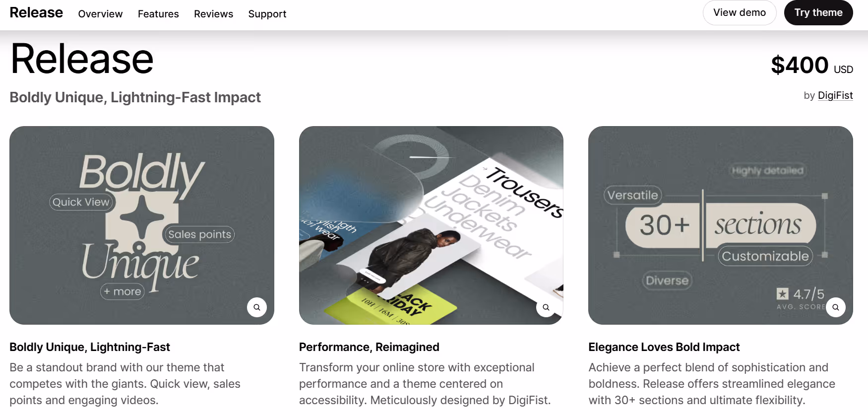
Release is built to provide a flexible and modular layout for Shopify stores, allowing merchants to present products and collections in a clear, structured way. The theme offers customizable sections for homepages, product pages, and collection pages, making it easy to organize content according to the store’s priorities. Users can adjust grids, images, and text blocks without coding, giving them control over how products and promotions are displayed to visitors.
Release also includes features that help streamline the browsing experience. Sections for featured collections, banners, and flexible content blocks allow stores to highlight specific products or campaigns efficiently. The theme is designed to work well across desktop and mobile devices, maintaining readability and smooth navigation. Integration with Shopify’s built-in tools ensures that additional functionality can be added without complicating the setup.
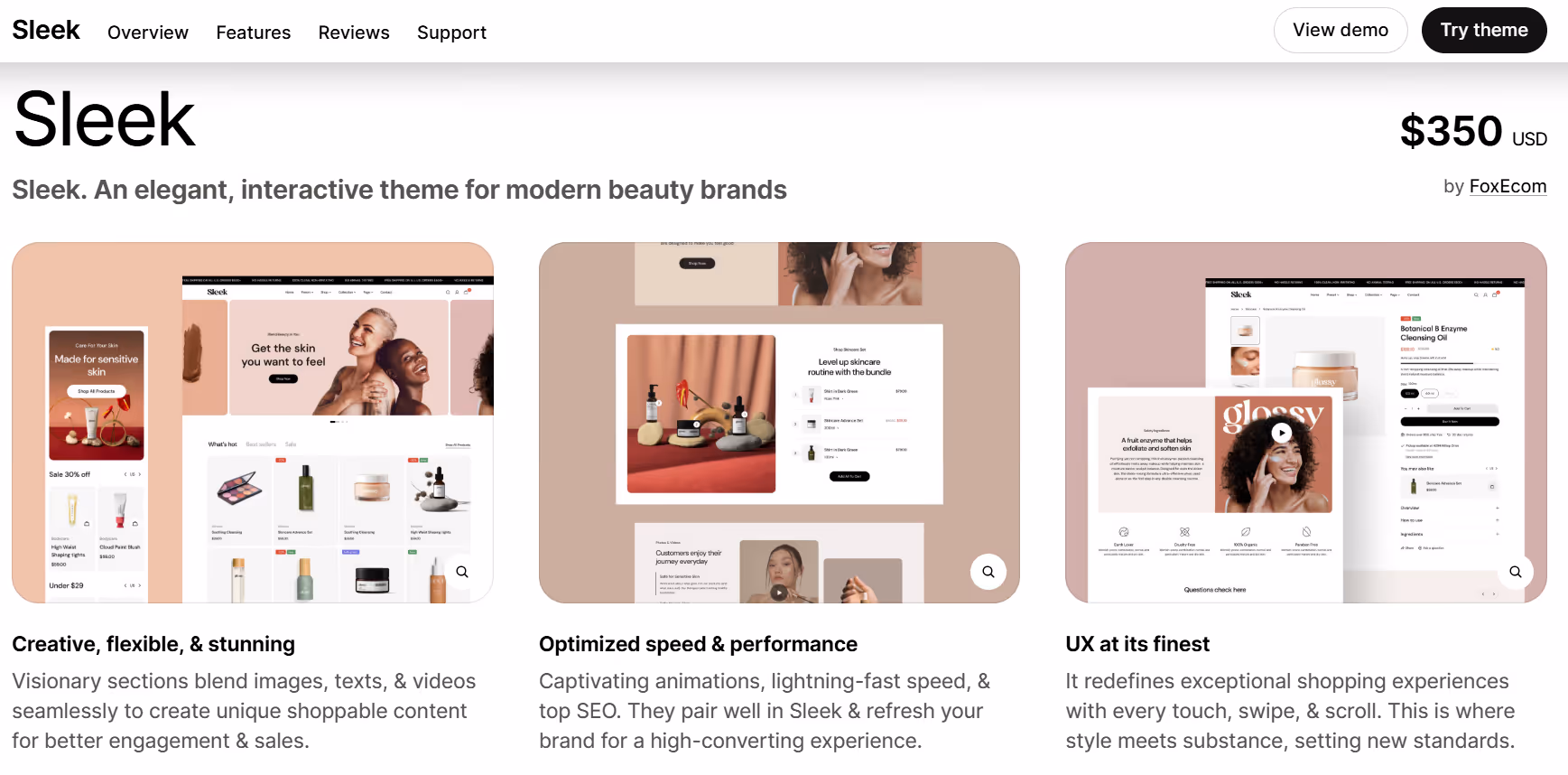
Sleek provides a minimalist layout that emphasizes product visibility and simple navigation. The theme includes customizable sections for homepages, product pages, and collections, allowing merchants to organize images, text, and featured items without touching code. The focus on clean lines and clear structure makes it easier for visitors to browse products, understand information quickly, and explore different sections of the store.
Sleek also includes options for highlighting products and promotions in a subtle but organized way. Flexible content blocks, banners, and featured collections allow stores to manage key elements efficiently. The theme is built to perform well on both desktop and mobile devices, maintaining a consistent user experience across platforms. Integration with Shopify’s ecosystem allows additional functionality without complicating the setup or workflow.
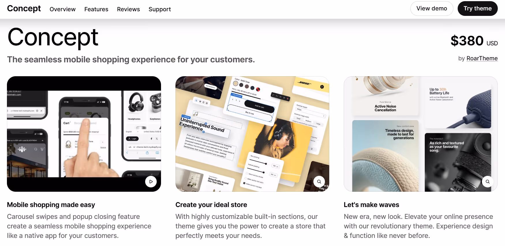
Concept focuses on creating a clean and modern layout that balances visuals with product information. The theme provides customizable sections for homepages, product pages, and collections, allowing merchants to arrange images, text, and featured products in ways that fit the store’s style. The structure is straightforward, helping visitors navigate quickly while keeping the browsing experience organized and consistent.
Concept also supports tools to highlight products and campaigns effectively. Flexible content blocks, banners, and featured collections allow stores to manage key information without complicating the design. The theme is optimized for both desktop and mobile devices, ensuring smooth performance and readability across platforms. Integration with Shopify’s ecosystem makes it possible to add extra features without introducing unnecessary complexity.
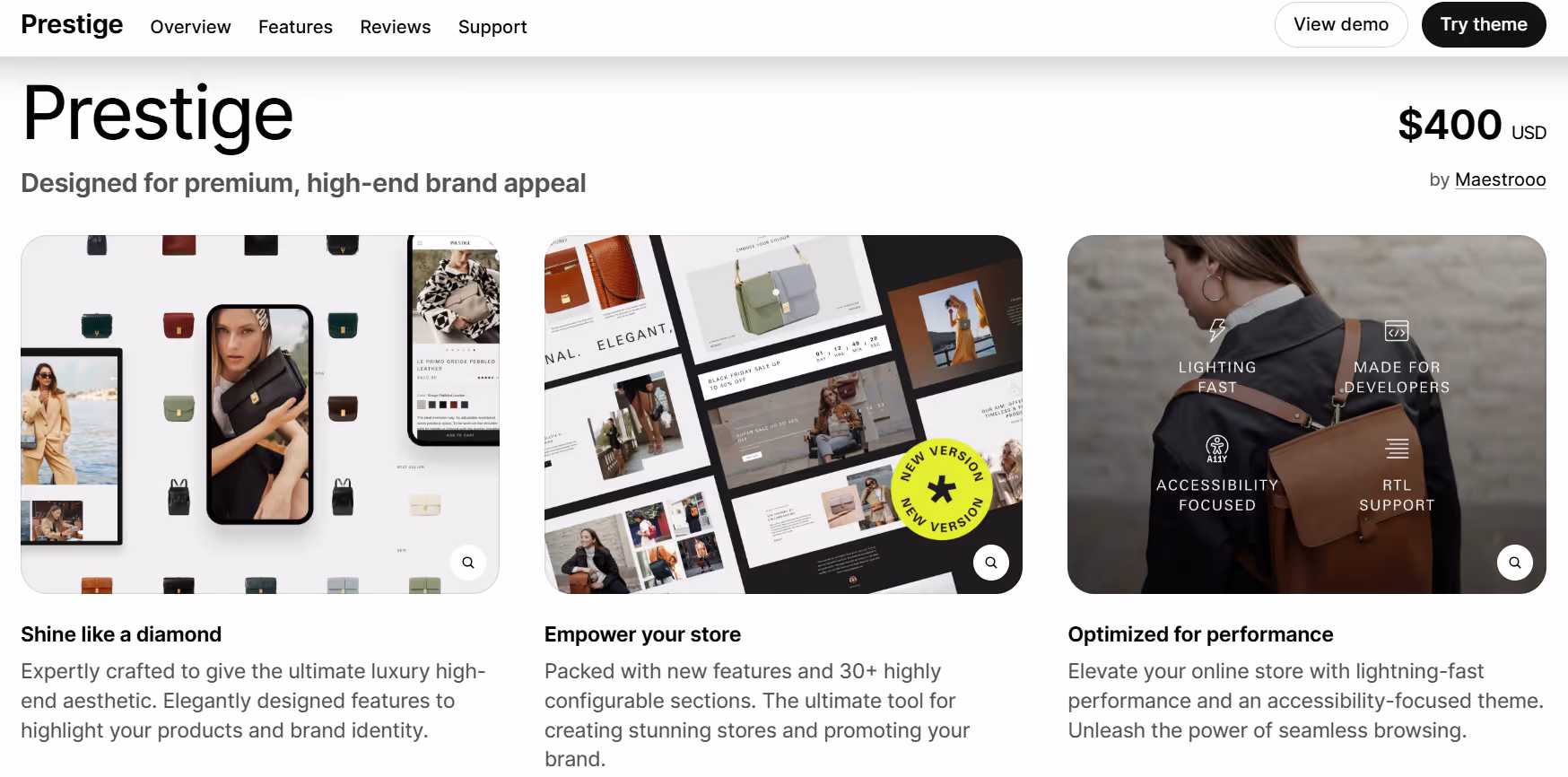
Prestige offers a refined and polished layout focused on presenting products with clarity and elegance. The theme provides flexible sections for homepages, product pages, and collections, giving merchants control over the arrangement of images, text, and featured items. Its clean structure supports a consistent browsing experience, making it easier for visitors to explore products without feeling overwhelmed.
Prestige also includes tools to highlight specific products or campaigns. Sections for banners, featured collections, and flexible content blocks help organize key information effectively. The theme performs well across desktop and mobile devices, maintaining smooth navigation and readability. Integration with Shopify’s ecosystem allows for adding extra features without complicating the store setup.
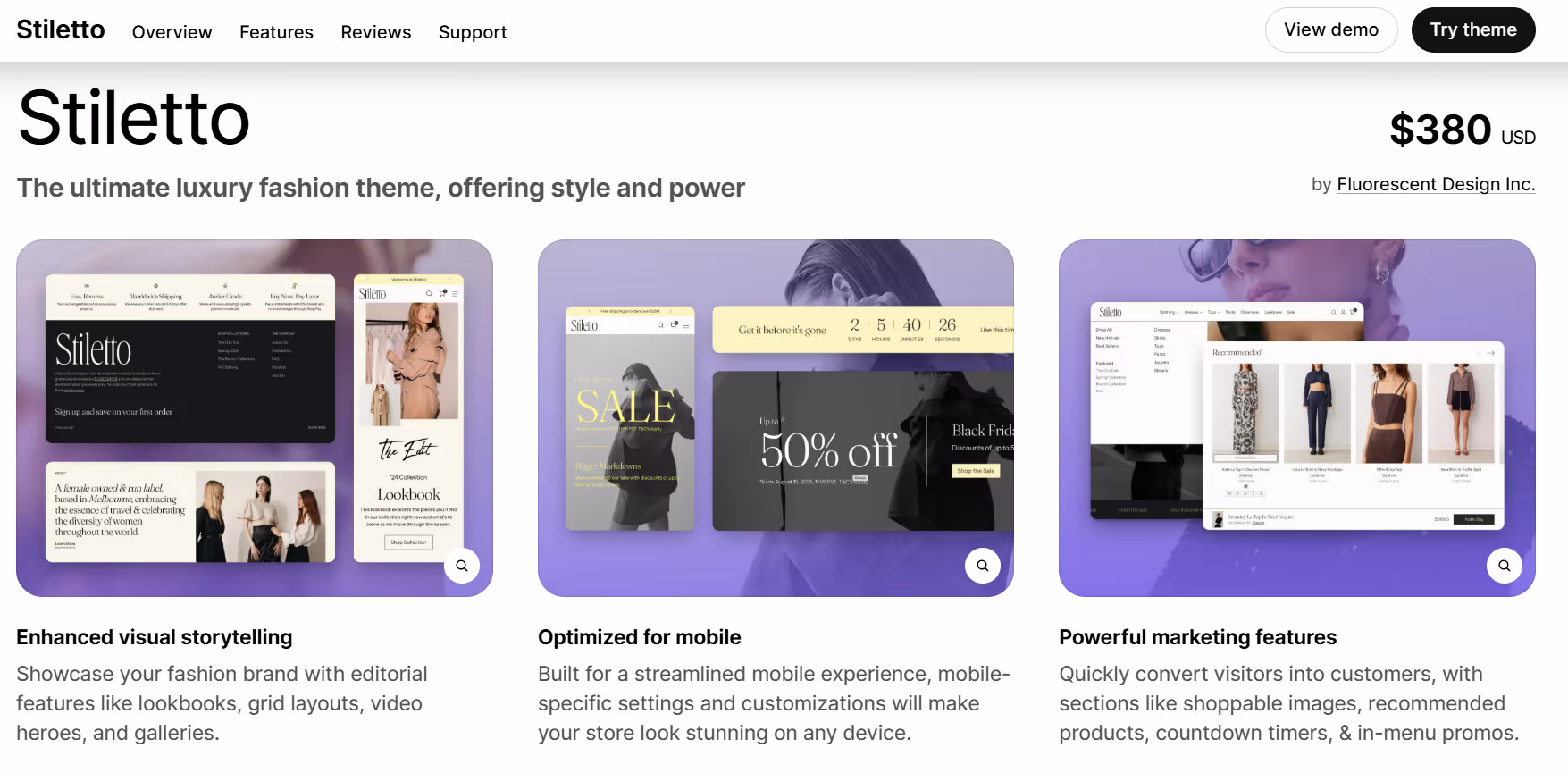
Stiletto features a modern and streamlined layout that emphasizes product imagery while keeping navigation simple. The theme offers flexible sections for homepages, product pages, and collections, making it straightforward for merchants to organize content and showcase featured items. Its clean design supports a consistent browsing experience and allows visitors to focus on the products without unnecessary distractions.
The theme also includes tools for highlighting promotions and special collections. Flexible content blocks, banners, and featured product sections help organize key information clearly. Stiletto is built to perform well on both desktop and mobile devices, maintaining readability and smooth navigation across platforms. Integration with Shopify’s ecosystem allows for extending functionality without adding complexity to the store setup.
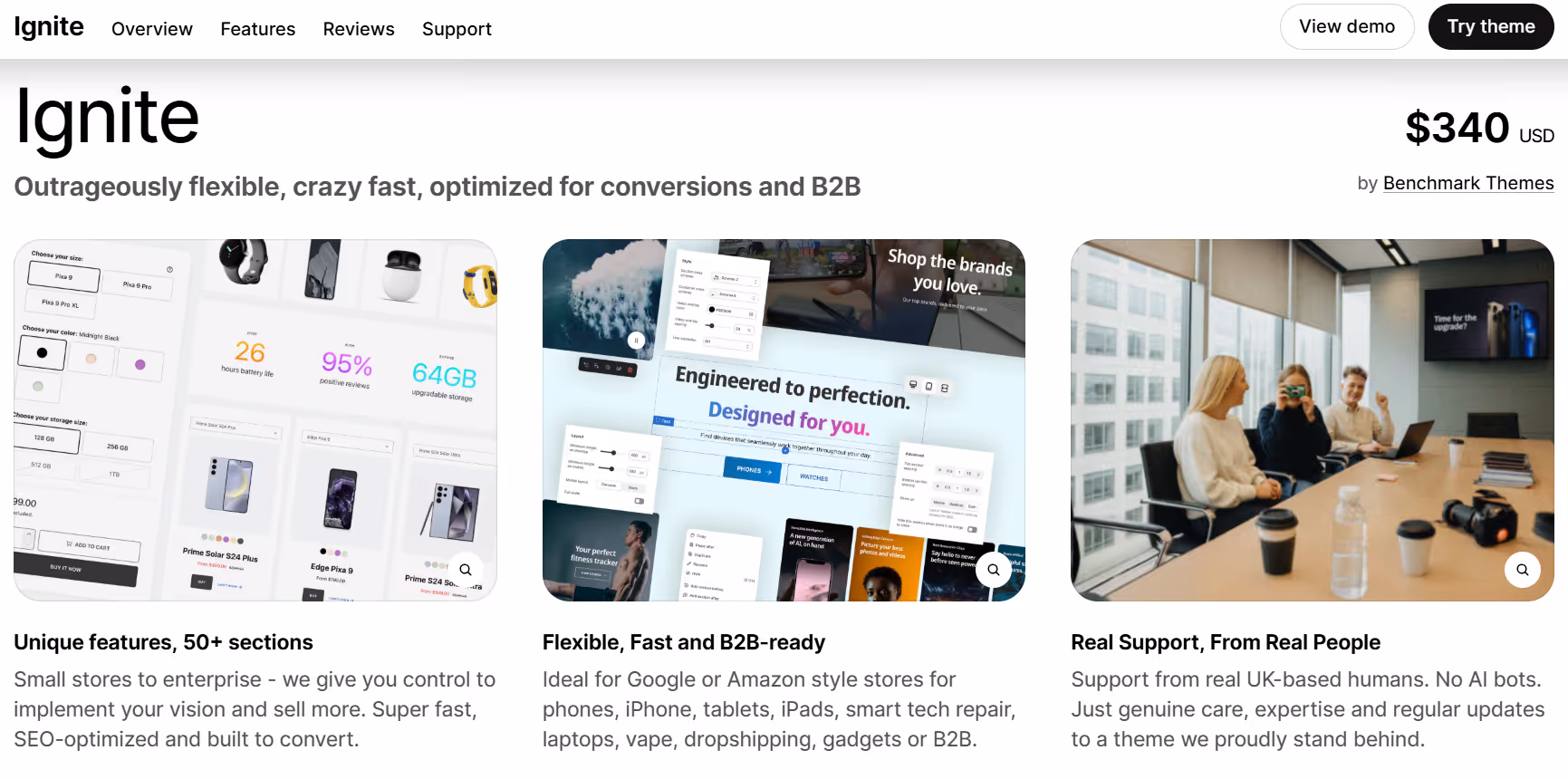
Ignite presents a bold and contemporary layout designed to put products front and center. The theme includes flexible sections for homepages, product pages, and collections, allowing merchants to organize images, text, and featured items in a visually engaging way. The structure is clear and straightforward, helping visitors explore the store easily and focus on the products without distraction.
The theme also includes tools to showcase featured products and promotions. Sections for banners, flexible content blocks, and highlighted collections give stores the ability to structure important information effectively. Ignite is optimized for desktop and mobile devices, ensuring smooth navigation and readability across different platforms. Integration with Shopify makes it possible to expand functionality without complicating the store setup.
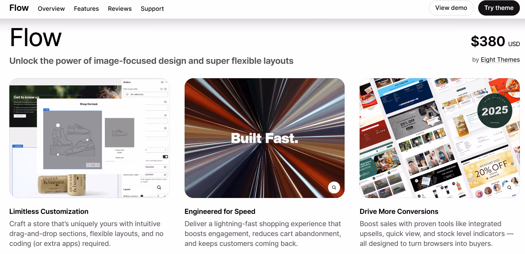
Flow offers a minimalist and clean layout that puts products and content into focus. The theme features customizable sections for homepages, product pages, and collections, making it easy to arrange content in a simple and organized way. Its design emphasizes clarity and usability, allowing visitors to navigate the store and explore items without distractions.
Flow also includes tools for organizing featured products, collections, and promotional content. Flexible blocks and banner sections help highlight key items while maintaining a consistent look throughout the store. The theme is optimized for both desktop and mobile browsing, ensuring a smooth experience on any device. Integration with Shopify allows additional functionality to be added without complicating the setup.
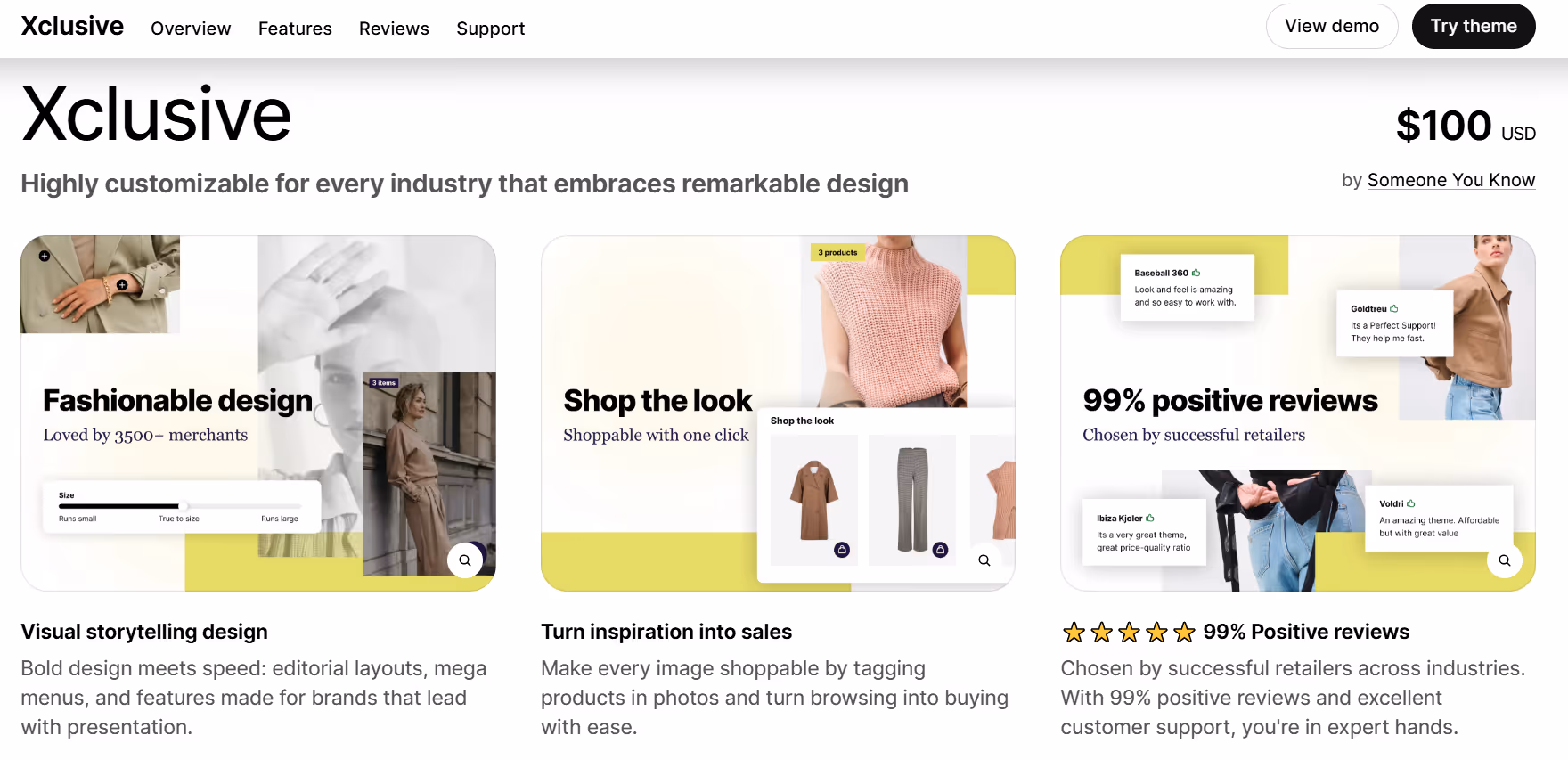
Xclusive focuses on a modern, versatile layout that adapts well to various product types and store sizes. The theme offers flexible homepage sections and product page options, allowing stores to organize content efficiently. It emphasizes clean typography and spacious design, making product images and details easy to view without clutter.
Xclusive also provides tools for highlighting collections, promotions, and featured items through dynamic sections. Its structure is responsive, ensuring consistent browsing across desktop, tablet, and mobile devices. Merchants can adjust layouts and visual elements without touching code, giving them a practical balance of control and simplicity.
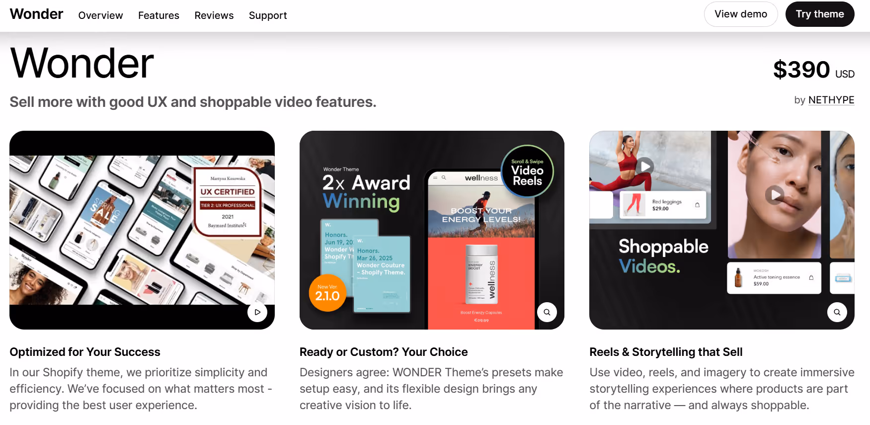
Wonder provides a clean and contemporary layout that allows stores to focus on visual storytelling. The theme emphasizes large imagery and flexible sections, helping merchants showcase products, collections, or promotions in a clear and organized way. It balances visual appeal with usability, keeping navigation simple while allowing for creative presentation.
The theme includes responsive design and customizable layouts, making it adaptable across devices and screen sizes. Merchants can easily adjust homepage sections, product pages, and featured content without needing coding skills. This makes it practical for stores that update offerings frequently or experiment with different layouts.
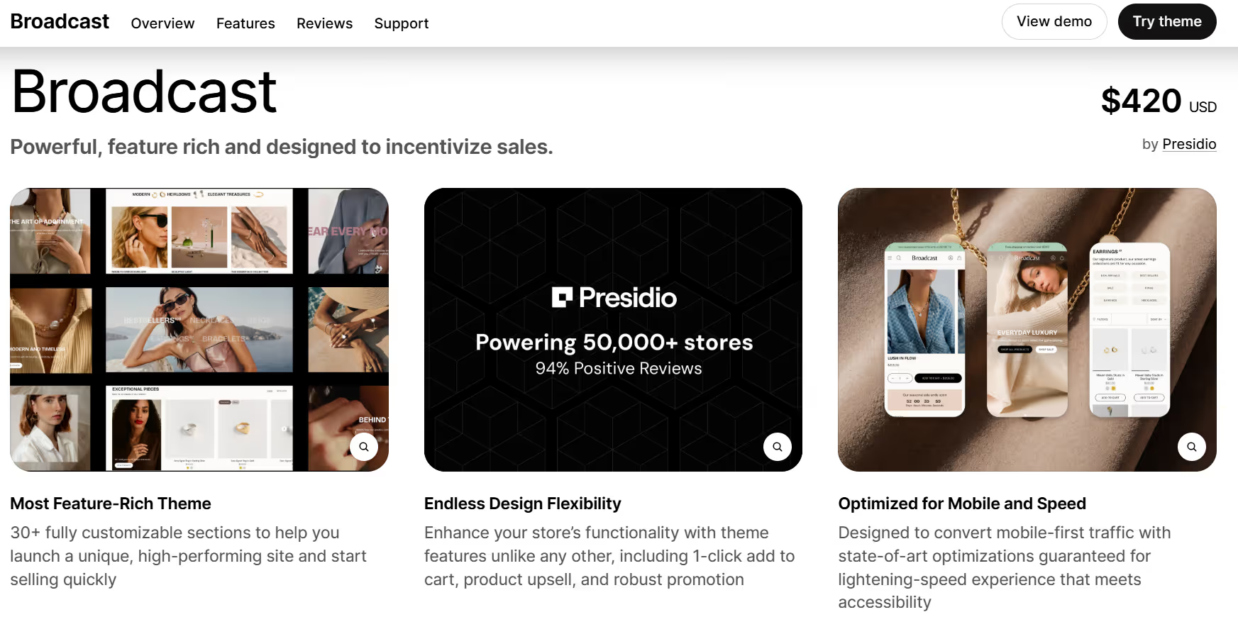
Broadcast focuses on a straightforward and adaptable layout, allowing stores to present content and products clearly. The theme emphasizes a balance between text and visuals, giving merchants space to highlight product details, collections, and promotions in a cohesive manner. Its structured design helps keep the shopping experience intuitive, while still offering flexibility for customization.
The theme includes built-in sections for featured products, promotional banners, and storytelling blocks, which can be rearranged as needed. Responsive design ensures that the layout works well on both desktop and mobile devices, making it practical for stores that reach customers across different screens. Overall, it provides a foundation for merchants to create a consistent, clean, and user-friendly store.
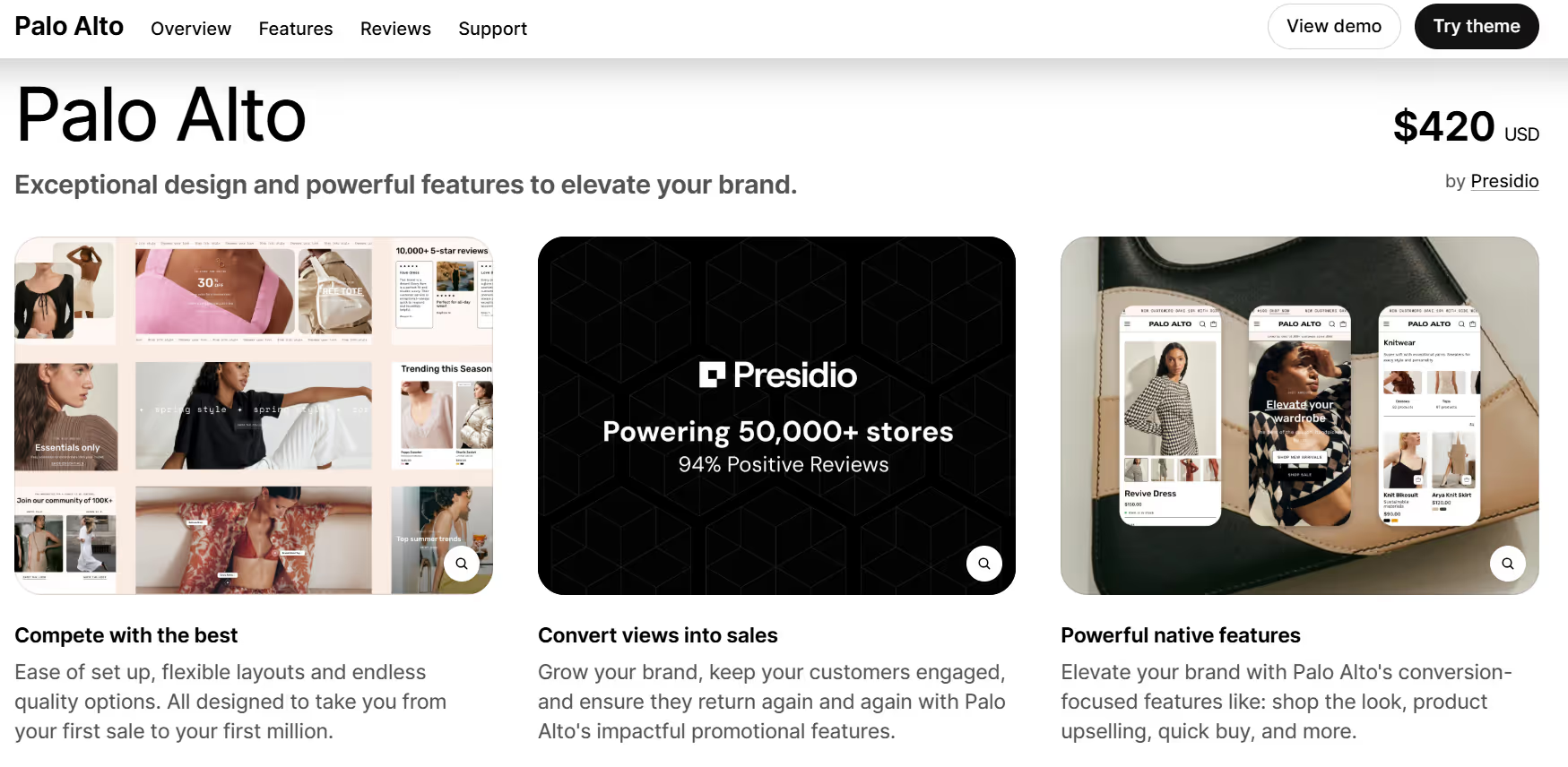
Palo Alto emphasizes simplicity and clarity, focusing on clean lines and an organized layout. The theme allows stores to present products and collections in a way that feels orderly without overwhelming visitors. Its design keeps essential information visible, making browsing straightforward and consistent across different pages.
The theme includes flexible sections for featured products, image galleries, and promotional content. Its responsive setup ensures the store adapts well to desktop and mobile devices, offering a uniform experience for customers. Overall, Palo Alto provides a structured, no-frills foundation for merchants looking to keep their store layout minimal and functional.
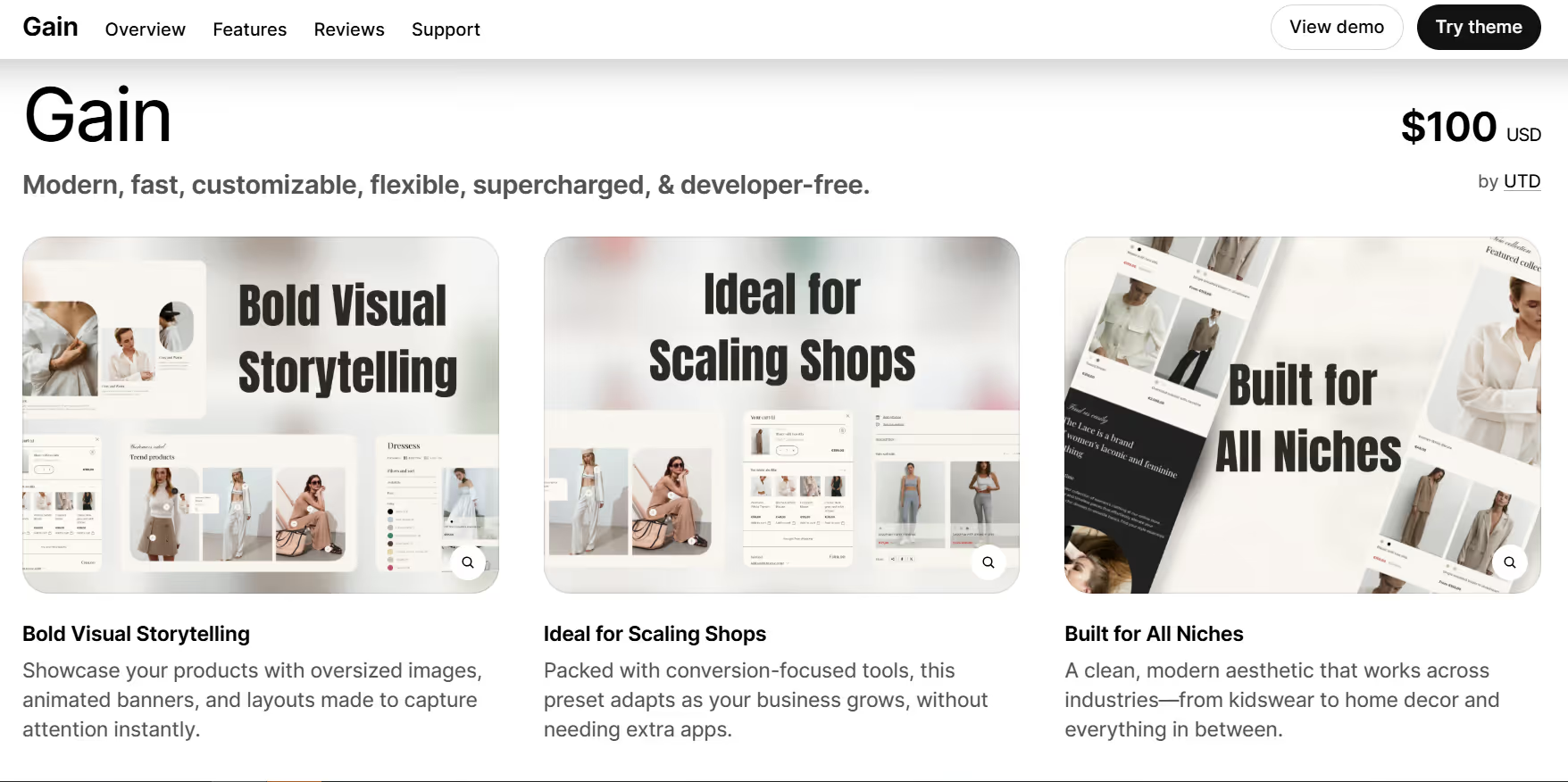
Gain focuses on providing a modern, versatile layout that balances visuals and product information. Its structure allows stores to display collections, promotions, and featured items without feeling cluttered. The theme keeps navigation simple while giving merchants room to highlight products through customizable sections.
It also supports various media formats, including high-quality images and videos, which can be integrated throughout the homepage and product pages. Gain adjusts smoothly across devices, making sure customers have a consistent experience whether they browse on desktop or mobile. The theme’s design encourages clarity and adaptability, helping stores maintain an organized appearance as their product range evolves.
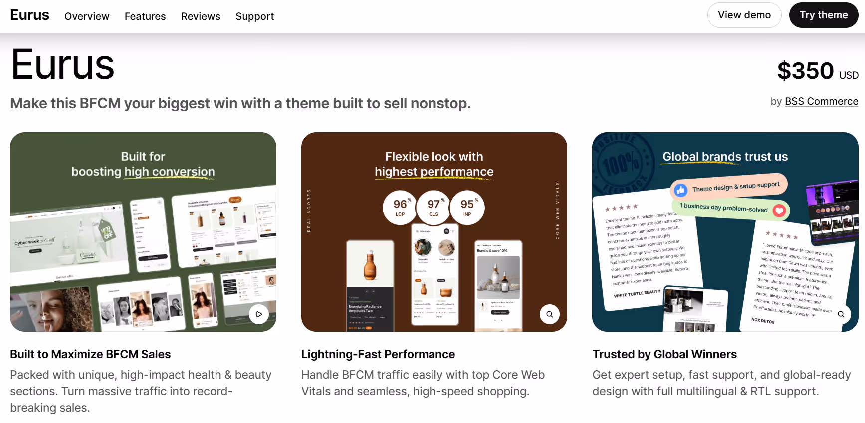
Eurus offers a clean and minimal design that keeps products in focus while allowing flexible layout options. Its structure makes it easy to feature collections, promotions, or specific items without overwhelming visitors. The theme provides clear navigation and organized sections, helping stores maintain a structured appearance even as product lines grow.
It also supports a range of media types, including high-resolution images and videos, which can be placed throughout the homepage and product pages. Eurus adapts smoothly across different devices, making sure shoppers have a consistent experience on desktop, tablet, or mobile. The theme emphasizes simplicity and clarity, allowing stores to present products effectively without extra clutter.
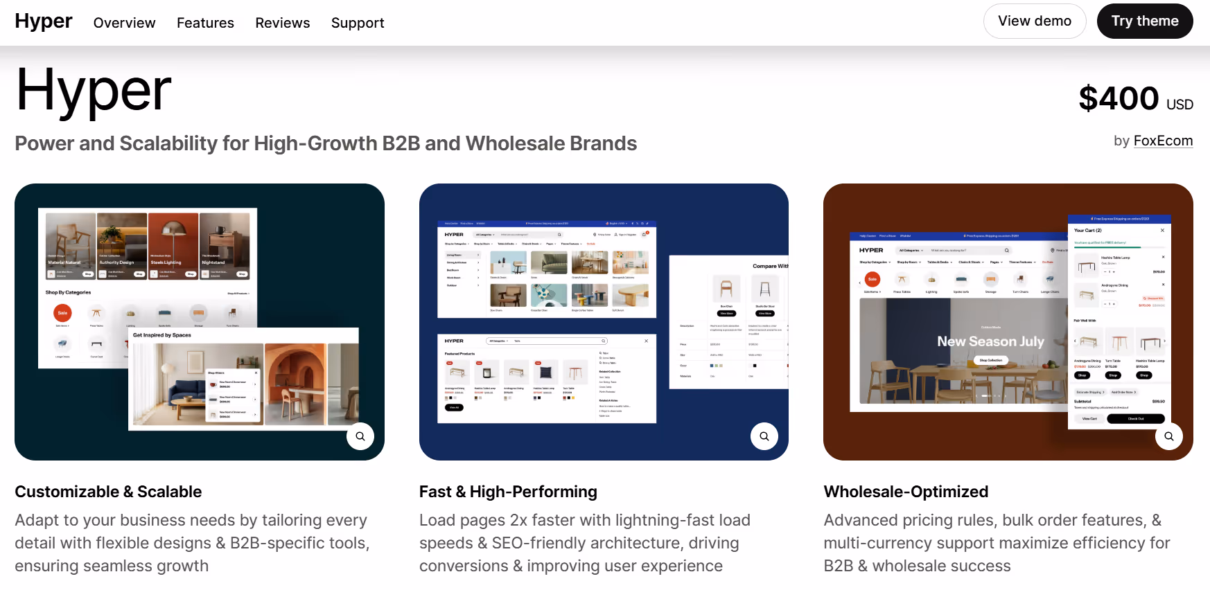
Hyper is bold, loud, and not shy about it. The first thing you notice? Big images, full-width videos, and a layout that really makes your products pop. If you’ve got killer photos or videos, this theme gives them room to shine. The sections are clearly laid out too, so people can scroll through collections or promotions without feeling overwhelmed.
The best part? It doesn’t break when someone’s on their phone or tablet. Everything scales nicely, stays readable, and feels natural to navigate. You can play around with featured collections, promos, or banners, and somehow it all just works together instead of looking chaotic. Hyper has that rare balance where it grabs attention but still keeps your store easy to browse.
Choosing a Shopify theme in 2026 isn’t just about picking something that looks nice on the surface. It’s more about finding a layout that actually works with the way a store sells, the types of products it offers, and the kind of experience shoppers expect. Some themes lean into big visuals, others prioritize speed or clean organization, and plenty of them try to strike a balance somewhere in the middle. Once you start comparing them side by side, it becomes clear that the right theme does a lot of the heavy lifting long before anyone clicks Add to Cart.
If there’s one takeaway from exploring all these options, it’s that there’s no single perfect choice. Every theme brings its own strengths, quirks, and little design decisions that can help a store feel more like a brand rather than just another template. The best approach is usually to look at what your customers need first and then find the theme that supports that experience without getting in the way. When the design, structure, and flow all work together, the store just feels easier to browse, and that alone can make a noticeable difference as you grow.


